







Dip your toes into the deep, intense blue of phthalocyanine blue red shade. This single pigment color has a red undertone, high transparency and major tinting impact. It's made from the modern synthetic pigment phthalocyanine and gives you serious potency on the palette.
ORIGINS
Phthalo blue red shade is part of a family of vivid blue and green dyes based on variants of copper phthalocyanine, a material first explored in the 1930s. IThe deep blue compound is produced by the reaction of phthalic anhydride, urea, copper and ammonia. n 1937, DuPont started producing copper phthalocyanine blue in the USA under the trade name Monastral Blue after it had been previously launched in the UK by ICI and in Germany by I.G. Farbenindustrie in 1935. Phthalo blue was introduced as an industrial pigment in 1935, with its green sibling first sold three year later, in a blue or yellow shade variant. Once launched, the phthalo colors quickly became popular with artists due to their intensity and versatility.
WHERE IS IT USED?
Grab a book, wash your hair, take a stroll on the lawn. You’ll find all forms of phthalo blue used as a colorant in all kinds of everyday places - from printer’s ink to shampoo and turf stain. The commercial paint and dye industries love it due to its lightfastness, stability, high tinting strength and resistance to the effects of both acids and alkalis. It’s also used in coatings, plastics and tattoo ink.
In the art world, phthalo blue has been used by many of the leading lights of the contemporary scene - from Kandinsky and Yves Klein to Roy Lichtenstein. Prolific American painter and illustrator Maxfield Parrish (1870-1966) used phthalo blue red shade in several of his hugely popular neo-classical, supersaturated works. He drew on the pigment’s standout impact both in his underpaintings and when creating his signature vivid skies – using it as a glaze over a very white ground. Incidentally the National Museum of American Illustration deemed his painting Daybreak (1922) to be the most successful art print of the 20th century, and at one point, a print of it hung in 25% of American homes.
HOW TO USE IT
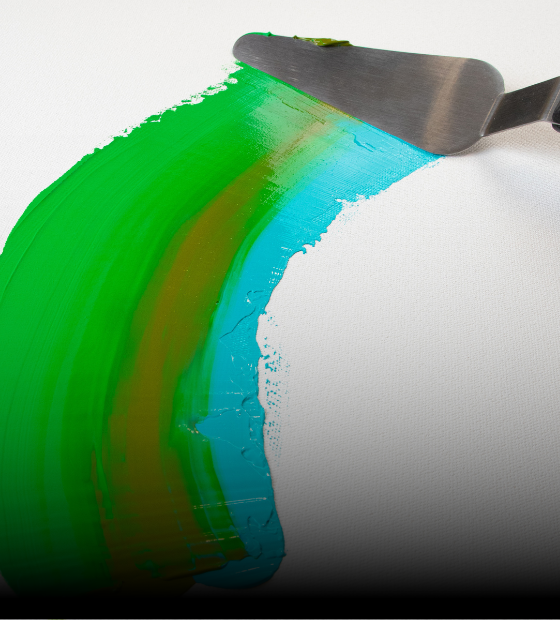
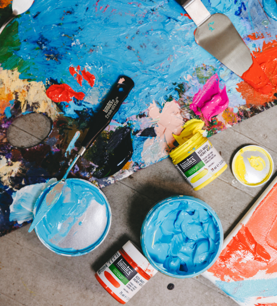
A little goes a long way. Phthalo blue red shade has real strength and can easily overpower other colors in mixes. Straight from the pot, in masstone, it’s a deep dark blue. Knife on a thin layer and spread to reveal its clean transparency with glowing nuances – it’s especially luminescent on a white ground.
Want a tint? Here’s where you’ll see the full punch of this dominant blue. Phthalo blue red shade makes mincemeat of white and eats it up, so you need to load it in to get a workable tint. When you do, you’ll find it’s warmer than phthalo blue green shade, giving a mellow, confident, mid-temperature intensity.
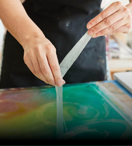
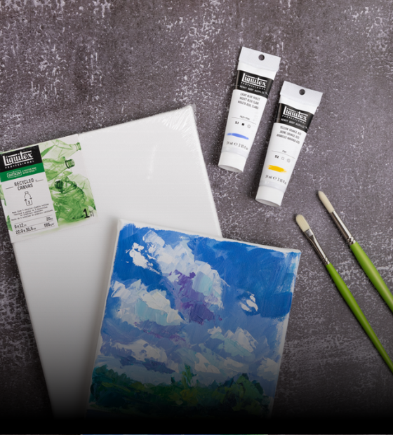
Use it in measured amounts to mix with other colors on your palette – due to its dominance, you’ll find it a seriously economical mixer. Its power is superior to that of Prussian blue or ultramarine: much brighter than Prussian blue and less purple than ultramarine. Experiment with mixes to achieve a host of muted blues which are perfect for authentic skyscapes and water scenes. Add a dash to Quinacridone Rose for shadows and shading and shadows. Glazing is another seriously effective string to the bow of phthalo blue red shade and a technique you must try. Its clean transparency and high staining power demand to be mixed with Liquitex Glazing Fluid and layered up. The result will be gleaming, vivid and knockout luminous.
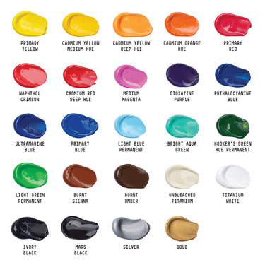
Find Phthalo Blue Red Shade in Liquitex Heavy Body, Soft Body and Acrylic Ink.