


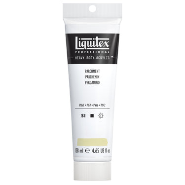
Creamy, warm, historic and calm, it’s time to roll into the world of Liquitex Parchment. This opaque off-white, highly versatile color is a mix of four pigments: carbon black: PBk7, phthalo green (PG7), titanium white (PW6) and transparent yellow iron oxide (PY42). Inspired by the traditional scraped animal skin used for writing from early history, Parchment conjures up a sense of antiquity, heritage and tradition. The word ‘parchment’ derives from ‘Pergamon’, the ancient Greek center of parchment production.
Parchment is part of Neutrals, one of our 2025 Color Trends. Here creamy tints meet pops of cool, crisp white, giving an open-minded, future-focused aesthetic. Pure but realistic, a nod to the past and look to the horizon, this palette pushes the boundaries.
HOW TO USE
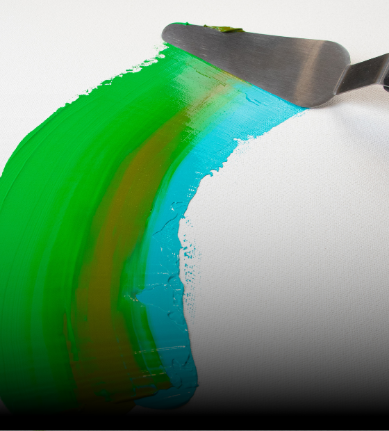
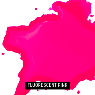
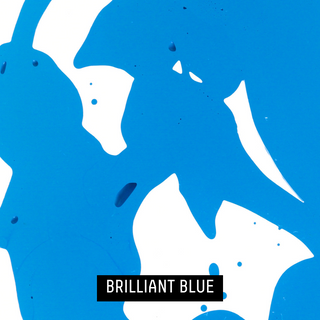
Parchment sits near beige and ivory on the color wheel and has underlying yellowy beige tones. As a light, nuanced color with a naturally organic feel, it’s a versatile neutral that can be used to create a sense of warmth, age or sophistication in all kinds of contexts. Its light, creamy hue resembles aged paper and can be used to create an understated palette with sands, champagne whites, taupes, soft clay tones and ecru colors. Use as a warm base for underpainting or combine with rich deeper tones for contrasting impact. Lay Parchment down with natural forest greens to dial up its warm, earthy side; juxtapose with deep charcoal grays to highlight its soft aspect. Hot terracottas emphasize Parchment’s subtle yellow facets while spicy cinnamons bring out its earthy vibes. Or get a complementary contrast with a soft mauve purple - try making a tint of Liquitex Light Blue Violet. Want to create a color clash that pops off your surface? Try Fluorescent Green – its vivid saturation contrasts with Parchment’s softness and gives a jarring intensity that can be useful. For another visually discordant pairing, combine with bright cyan: this cool color contrasts starkly with Parchment’s warmth.
PARCHMENT IN THE ART WORLD
Parchment as a material has been used as an important backdrop to lettering, illustration and painting for over two millennia. Being from a living source, the collagen in parchment melts slightly when water-based paint or ink is applied, forming a raised bed and creating a natural debossed effect. Artists in Medieval times created highly sophisticated compositions on parchment, using the color of the natural skin as a backdrop to single and multi-colored designs. Saint Louis Feeding the Sick from The Book of Hours of Jeanne d’Evreux by Jean Pucelle in the 1320s, is a prime example, showing religious figures rendered with incredible detail, now held as part of NYC’s Metropolitan Museum of Art Cloisters Collection. Back in the 15th and 16th centuries, Catholic communities used parchment for religious crafts with first communion gifts, cards and devotional pictures fashioned from intricately cut lace-like parchment.
Although cheaper materials like paper and canvas have taken over, parchment is still used for some ritual and official business. In the UK, each new official Act of Parliament is printed on vellum, and parchment is still the only medium used by traditional religious Jews for Torah scrolls. Some contemporary artists like the changeable nature of parchment’s surface which can be harnessed like an active participant in making artwork.
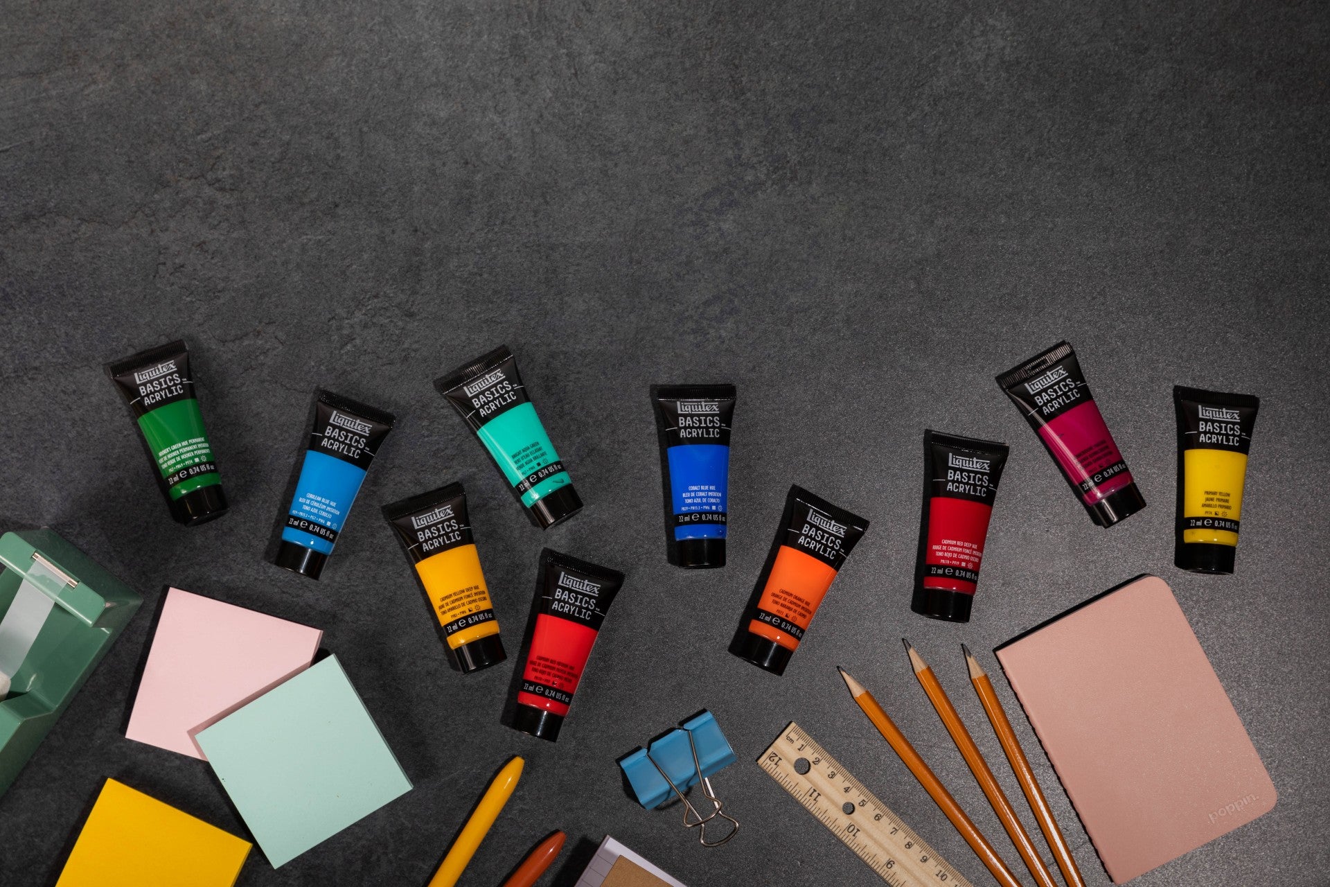
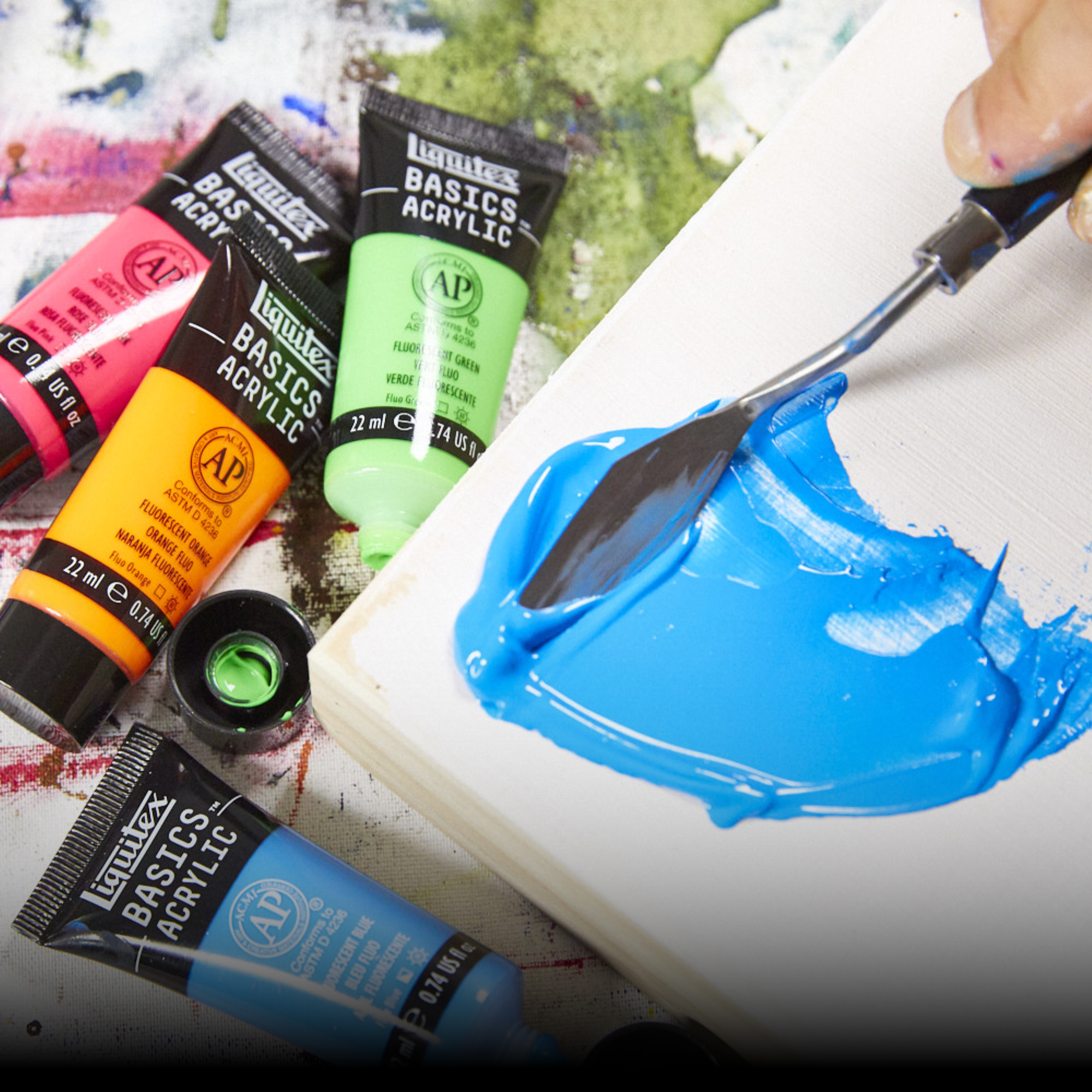
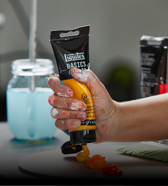
Liquitex Parchment is available in: Heavy Body, Soft Body, Acrylic Marker, Spray Paint and Basics Acrylic

![LQX BASICS ACRYLIC PARCHMENT [SWATCH]](http://www.liquitex.com/cdn/shop/files/140855_375x375_crop_center.jpg?v=1762458735)


NEUTRALS
What’s next in color? Think grounded, wintery tones that feel calm, tactile, and close to nature. Soft clays, warm stones, chalky whites, and raw, unbleached hues bring a sense of quiet depth. It’s earth over ether. Texture over tech.
Organic shapes lead the way; rounded forms, soft ridges, and natural contours inspired by coral, snowdrifts, and wind-smoothed surfaces. Creamy peaks, subtle layers, and matte finishes create a palette that feels warm, honest, and handmade.
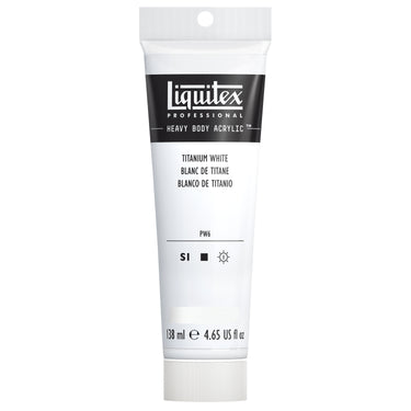
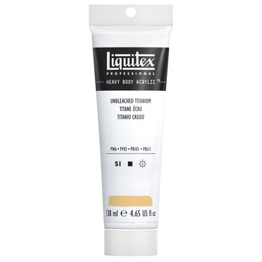
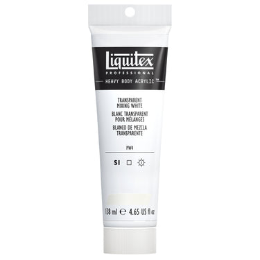
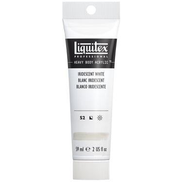
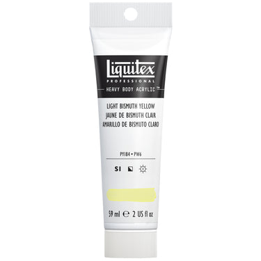
Looking to build A Neutrals palette? Start with Parchment and pair it with optic whites, soft chalks, unbleached cotton tones, and blond woods. Then round it out with Unbleached Titanium, Iridescent White, Titanium White Light Bismuth Yellow, and Transparent Mixing White for a dappled mix of subtle shades, glow, and opacity.
Grounded. Calm. Winter-ready. A palette shaped by nature.
Explore all of our 2025 Color Trend Palettes


![LQX ACRYLIC MARKER SET 6X 2-4MM CLASSICS [CONTENTS] 887452001225](http://www.liquitex.com/cdn/shop/files/68762_375x375_crop_center.jpg?v=1707320720)

![LQX BASICS 24X22ML PAINT SET 887452028543 [FRONT]](http://www.liquitex.com/cdn/shop/files/80833_375x375_crop_center.jpg?v=1762458732)


![LQX BASICS 6x118ML SET 887452059226 [SET WITH CONTENTS 2]](http://www.liquitex.com/cdn/shop/files/130398_375x375_crop_center.jpg?v=1707324060)
![LQX BASICS 6x118ML SET 887452059226 [FRONT]](http://www.liquitex.com/cdn/shop/files/130396_375x375_crop_center.jpg?v=1762458768)