

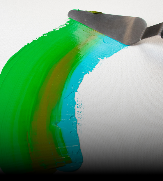
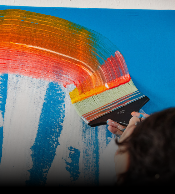

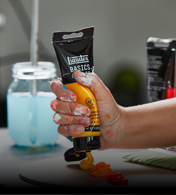

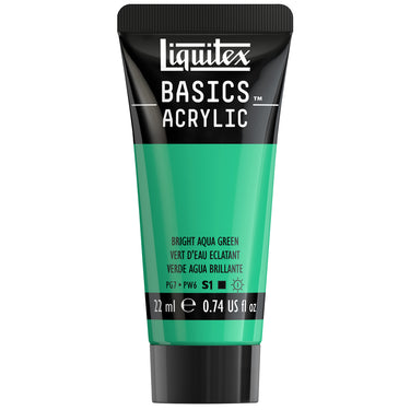
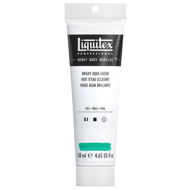
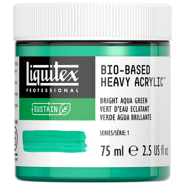
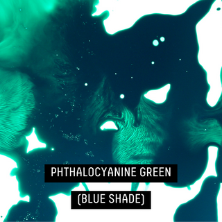
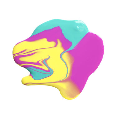
Dig into the vivid depths of Liquitex Bright Aqua Green. Vibrating with light and energy, this high-impact green-blue is made from a mix of phthalocyanine blue, titanium white and phthalocyanine green (blue shade). Squeeze straight from the tube to get a confident and nuanced mass tone with a high opacity.
ORIGINS
Bright aqua delivers a blast of aqueous energy and has traces back to ancient history. Latin for water, it often symbolizes purity and serenity. Aquatic greens - along with more earthy greens - were popular in Ancient Egypt, where early artists first depicted Osiris, their god of agriculture, as a bright green being. Hapi, the Nile god was also painted with blue-green skin and hair, connecting him with the life-giving power of the river. These early artists used natural dyes made from vivid green stones, earth and minerals such as malachite, which were ground up and combined with plant matter. From papyrus paintings to Medieval stained-glass and Renaissance fashion, bright aqua greens have turned up throughout the history of decorative arts.
WHERE IS IT USED?
The multi-facetted colors of the bright aqua green spectrum can be seen in water and plantlife studies, in depictions of imaginary science fiction universes, in industrial design and as a key color for lifestyle accessories. In the artworld, the prolific French Impressionist Claude Monet was a big user of aqua green, drawing on it frequently in his long-running Giverny garden series. It helped him to capture the mesmerizing, ever-changing water surfaces of his ponds in a series that spans over 250 paintings. See it in Water Lilies, Green Reflection (1914) and Water Lilies Pond, Evening Panel (1926) and many more.
Aqua was celebrated in the mid-century modern palettes of the 1950s and ‘60s, bringing promise of a new future and a change in direction from the more somber colors of the War years. It brought fresh zest and energy to clothing, cars and home interiors, hand in hand in with rock’n’roll, neon and the Youthquake of a new generation. The 1980s obsession with retro saw a resurgence, and in the hands of ‘80s Italian design and architecture group the Memphis Milano, aqua green came alive again alongside pastel pinks, sunny yellows, cool blues and warm oranges in postmodern furniture, textiles, lighting, sculpture and ceramics.
Bright aqua colors can be seen in Islamic art, often in places of worship and in religious artifacts - from carpet designs to complex stone inlays. Aqua is important in the world of print and computer graphics. The hex code (the code system used in web design and computing to define colors) for aqua was originally called cyan - was one of the three essential colors in print. It was redefined as aqua by the X11 color names popularized by the World Wide Web Consortium’s HTML 3.2 palette in 1997. Now aqua and cyan are used synonymously in computer graphics.
HOW TO USE
Harness the refreshing, positive energy of Bright Aqua Green and use it to paint seascapes, play with cool shadows, create graphic colorblocking, impactful prints and more. Contrast it with warm, vibrant colors to maximise impact – try lining it up next to sunset colors like fuzzy peachs, coral pinks, orangey magentas and warm golds. Bring out its crisp, cool aspect by pairing with clean whites and pale grays, or dial up its more subtle depths by combining with softer shades of cream and taupe.
Build Bright Aqua Green into maritime scenes and waterscapes by surrounding it with a full spectrum of tonal greens and blues - from glittering deep navy to the lightest seafoam mints, turquoises and teals. Use it to create foliage and plant botanicals. Bright Aqua Green is handy when laying down wintery landscapes, filled with blue-based conifers and evergreens. Use it to highlight and add background intrigue - or contrast it against yellow-based greens.
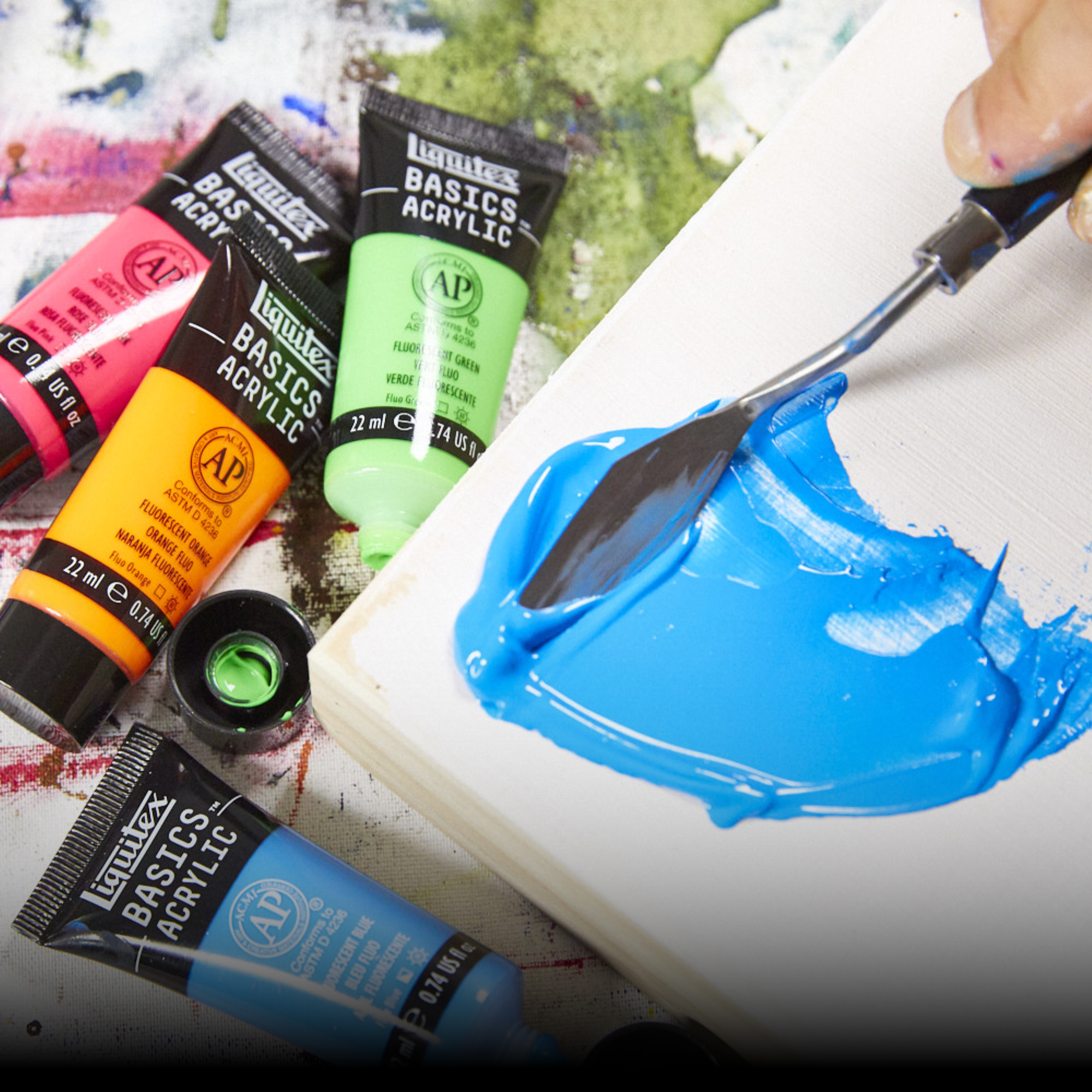
Mix Bright Aqua Green with white to get a tint full of zingy vibrancy. Try colorblocking against opaque pastel rose pinks to really amplify its powers.
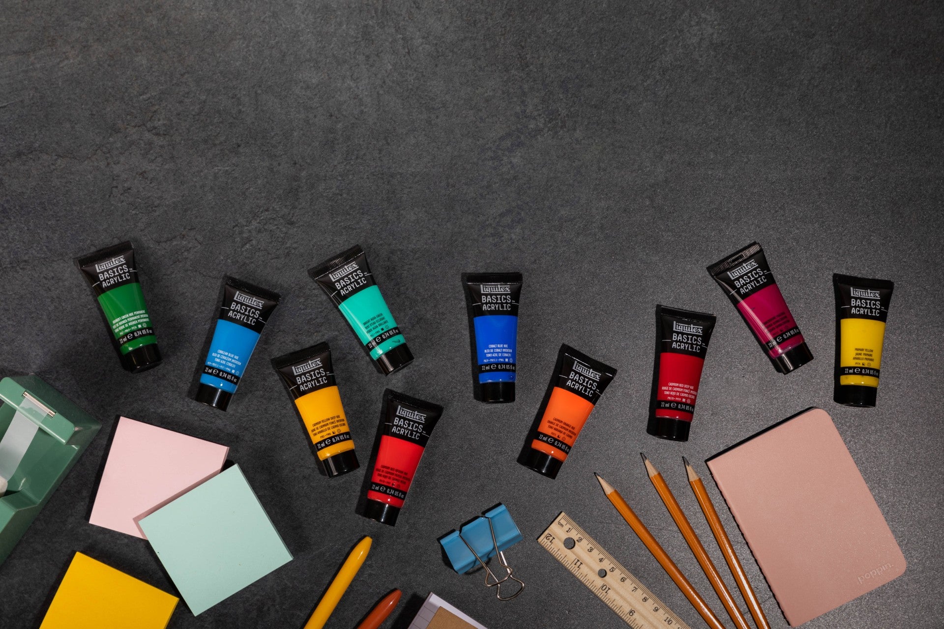
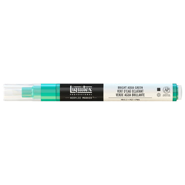
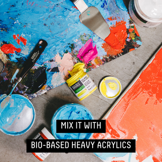
Find Bright Aqua Green in Liquitex Heavy Body Acrylic, Bio-Based Heavy Acrylic, Soft Body Acrylic, Acrylic Gouache, Acrylic Marker, Basics Acrylic and Basics Acrylic Fluid.
SHOP BRIGHT AQUA GREEN
![LQX BASICS ACRYLIC BRIGHT AQUA GREEN [SWATCH]](http://www.liquitex.com/cdn/shop/files/140811_4794bd56-15f4-4352-a8be-00beba0b7adb_375x375_crop_center.jpg?v=1762458504)
![LQX ACRYLIC MARKER 660 BRIGHT AQUA GREEN [WEBSITE SWATCH]](http://www.liquitex.com/cdn/shop/files/71594_375x375_crop_center.jpg?v=1762458453)
![LQX BASICS FLUID ACRYLIC 118ML BRIGHT AQUA GREEN 887452056034 [NA]](http://www.liquitex.com/cdn/shop/files/112707_375x375_crop_center.jpg?v=1763127794)


![LQX BIO-BASED HEAVY ACRYLIC BRIGHT AQUA GREEN [SWATCH]](http://www.liquitex.com/cdn/shop/files/135761_375x375_crop_center.jpg?v=1762459026)


LIQUITEX COLOR TRENDS
GEM THEORY
Bright Aqua Green feels at home in the Gem Theory color palette, highlighted as one to watch in 2026 by Liquitex. Bringing positivity to this precious jewel-inspired collection, it sits alongside saturated, prismatic hues mined from the dream world.
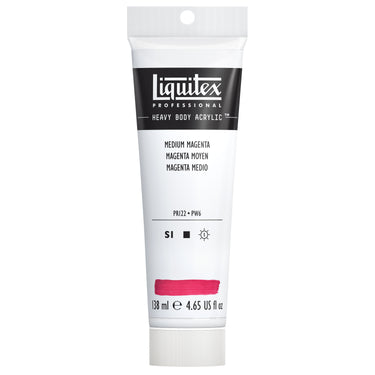
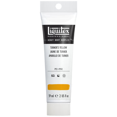
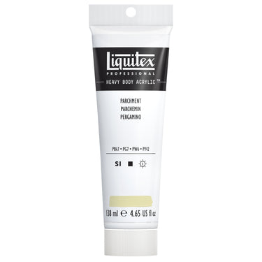
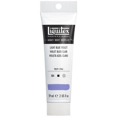
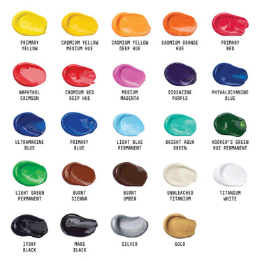
Shift your perspective and get a new lens on the world as the Gem Theory palette tilts the spectrum and layers like facets under light. Work your way to the core with Liquitex Turquoise Deep, Medium Magenta, Light Phthalocyanine Green, Light Blue Violet, Bright Aqua Green, Turner Yellow, Parchment, Mars Black and Titanium White. Gem Theory connects dark and light as a dash of psychedelics, softened edges and optimism, morphs form and focus.
Try the color combo in bold, graphic compositions, cosmic gradients, or delicate glazes with unexpected depth.


![LQX ACRYLIC MARKER SET 6X 2-4MM CLASSICS [CONTENTS] 887452001225](http://www.liquitex.com/cdn/shop/files/68762_375x375_crop_center.jpg?v=1707320720)

![LQX BASICS 24X22ML PAINT SET 887452028543 [FRONT]](http://www.liquitex.com/cdn/shop/files/80833_375x375_crop_center.jpg?v=1762458732)


![LQX BASICS 6x118ML SET 887452059226 [SET WITH CONTENTS 2]](http://www.liquitex.com/cdn/shop/files/130398_375x375_crop_center.jpg?v=1707324060)
![LQX BASICS 6x118ML SET 887452059226 [FRONT]](http://www.liquitex.com/cdn/shop/files/130396_375x375_crop_center.jpg?v=1762458768)
![LQX MATTE POURING MEDIUM SET [CONTENTS] 887452048695 [NA]](http://www.liquitex.com/cdn/shop/files/96237_375x375_crop_center.jpg?v=1762458531)